A Cork Box for Corks

I have an Aunt and Uncle that like wine and preparing gourmet food, and when I was at their place for Thanksgiving I noticed bags of corks.  Before Christmas, I told them that if they brought some corks for me, I would make it worth their while.
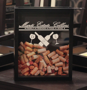
IMG_2709I picked up a plain black top-loading shadowbox at Michaels, as it was easier to just pay for one outright as opposed to having to building one from scratch (mostly didn’t want to deal with the glass cutting; plus, they’re really affordable).  I designed a logo that featured their name and their wedding year, along with their initials on the glasses.

Lessons Learned
The original plan was to cut the artwork out on the Cameo, then use some etching cream so the design would be etched in the glass.  However, I wasn’t thinking when I started weeding the contact paper and accidentally ‘inverted’ the design; the white parts of the logo would be clear, and all the parts around would be etched.  Eh, it’ll still work out.

I applied the cream, let it set for a pretty long time, then rinsed it off.  To my dismay, the etching was awful and splotchy.  I applied more cream to the bad parts, but to no avail.  I later learned that the cream isn’t good for etching large areas at once, as differences in the glass composition react to the cream differently.  The cream is much better used for stencil work.

Grabbed a new box (as I said, they’re affordable), and decided just to settle on using vinyl.  It looks pretty good, plus the white will contrast nicely over the corks when it starts to fill up.
Mackie’s Pendant

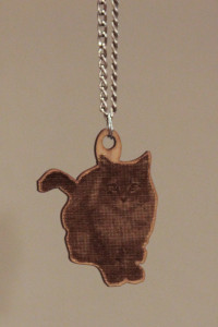
Decided to memorialize the fall of a fiend’s fallen comrade with a small piece of jewelry.  Up until now, everything I have lased has been purely vector format, so this marks my first foray into grey-scale imagery.

IMG_2710MSRaynsford had a series of articles where he was experimenting with reproducing grey-scale using a combination of power setting adjustments and halftone conversions for the photos.

I just went halftone, and adjusted the power, speed, and focusing distance until I was getting good blacks on the wood.

I went with MDF because it’s a uniform composition of wood; there’s no grain that will take different amounts of burning.  Plus the etching blows out the surface of the wood, so there’s no use in wasting wood with grain to it.

The final cut pass was generated by expanding the path around the photo, and came out with sharper corners than I anticipated.  I would have rounded them down with sandpaper, but then the parts I sanded down would be light exposed MDF contrasting with the blackened MDF generated after the cut pass.

Grabbed a fine silver (looking) chain from Michael’s, and it made for a fine memorial gift.

Lessons Learned
How to etch in grey-scale with a laser.

Christmas Boxes for Aunt Gloria

At thanksgiving, I drew my Aunt Gloria’s name out of the bowl for our family’s secret-santa.  Decided on making a pair of small boxes.

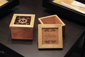
IMG_2705The bodies of the boxes are miter-joined Maple with Oak keys on the side edges.  The lids are a miter-joined Oak frame with 1/8″ laser-cut plywood set in a slot in the frame.

The box on the left is laser-cut all the way through.  It features my aunt and uncle’s name around a monogrammed initial, and is intended to be a potpourri box (I included a bag of potpourri to drive that point home).  The box on the right is etched with just my aunt’s name, and is intended to be just a keepsake or jewelry box.

Lessons Learned:
I should have used a darker contrasting wood for the keys, like Walnut or Purple Heart.  I was hoping the Oak wood would absorb more of the darker stain.  Also, some of the filigree work on the potpourri lid is alarmingly thin.  A couple small pieces broke off, and I had to break off the mirrored pieces to retain a symmetrical look.  The filigrees look like they just touch the lid frame, but they extend to a sturdy rectangular piece that runs around the entire inside of the slot it fits in, so the majority of it is surprisingly sturdy.

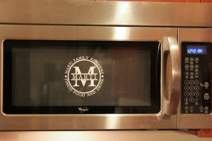
Marti Family Kitchens Logo

I was set on making a cutting board for my brother for Christmas, but I didn’t really know what I wanted to personalize with it.

IMG_3272
fig 1: click for logo embiggening

After futzing around for an hour or two, I finally decided on this design. I liked the look of it, so test it out I decided to send it to my Cameo.  I cut it out of plain white contact paper and adhered it to my microwave door. The contact paper is sticky enough to survive wipedowns with a sponge, but it would be easy to remove someday in the event I had to move.